Call Quality Insights
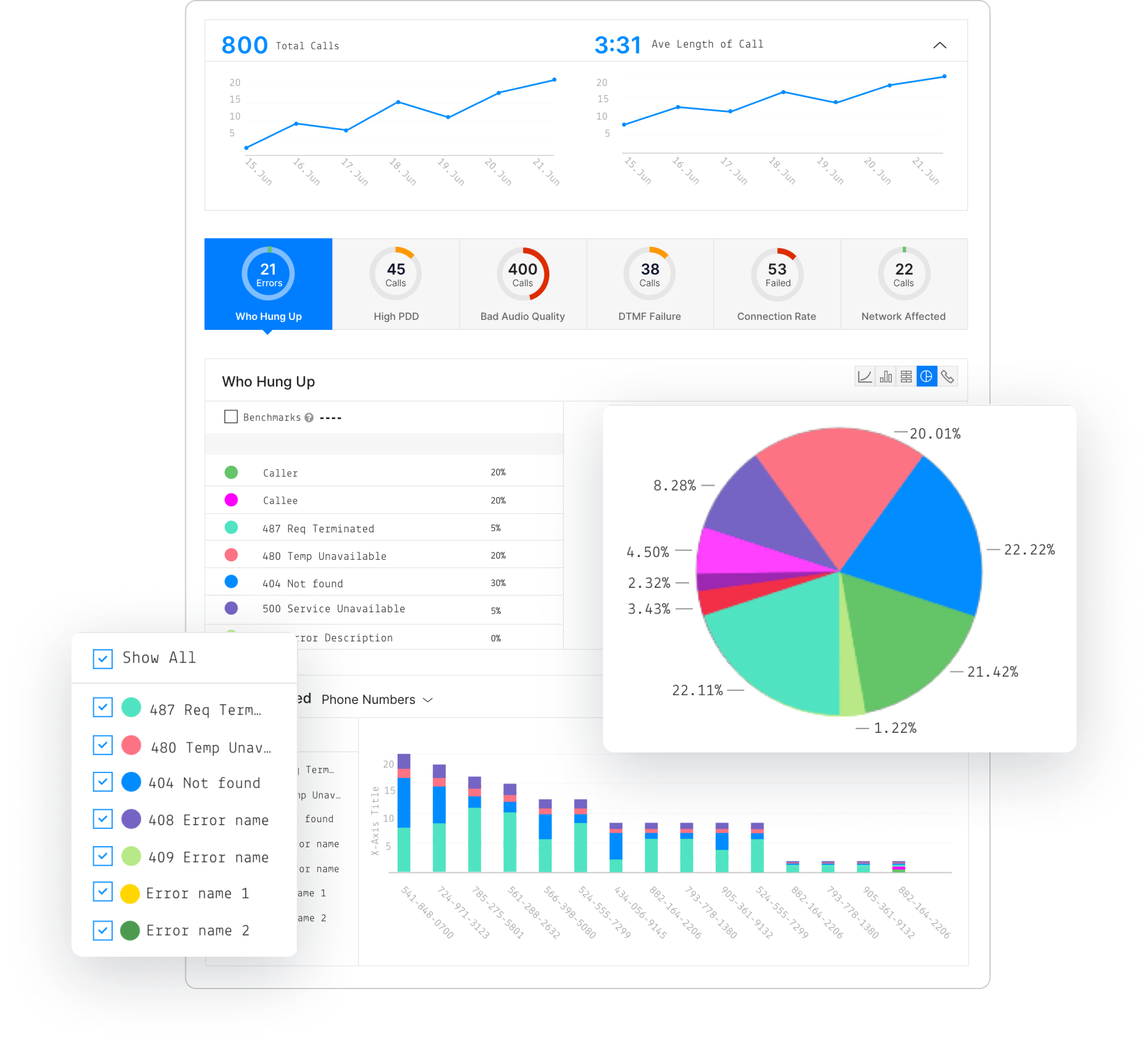
Twilio's Call Insights is a powerful tool that allows Twilio customers to monitor granular call data and assess call performance with confidence.
My role
In 2017, I joined a product manager and lead engineer to help bring Call Insights to life.
Problem
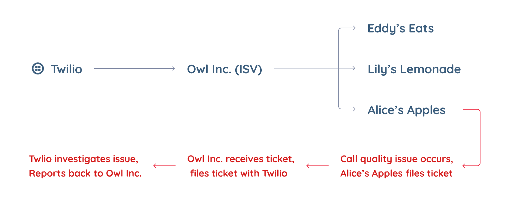
Twilio’s Programmable Voice API allows companies to build large-scale voice applications. Independent Software Vendors (ISVs) build software on top of Twilio's API, such as contact center solutions, and resell it to their customers. When those companies’ end-users have call quality problems, they contact the ISV, who files a ticket with Twilio's support team. It was taking 5-7 days to solve these tickets because of the many layers of complexity.
When I joined this project, the product manager and lead engineer had worked with our customer support team to identify the call quality issues customers were encountering. They'd also done a technical investigation to assess the feasibility of exposing each data type. They'd identified the following as required data types:
- Call dropping
- High post dial delay (PDD)
- Bad audio quality
- Dual tone multi frequency (DTMF) failure
- Call connection failure
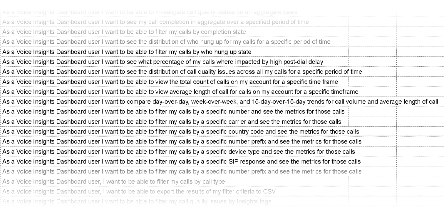
Together, we developed a list of user stories that needed to be addressed in the solution.
Design explorations
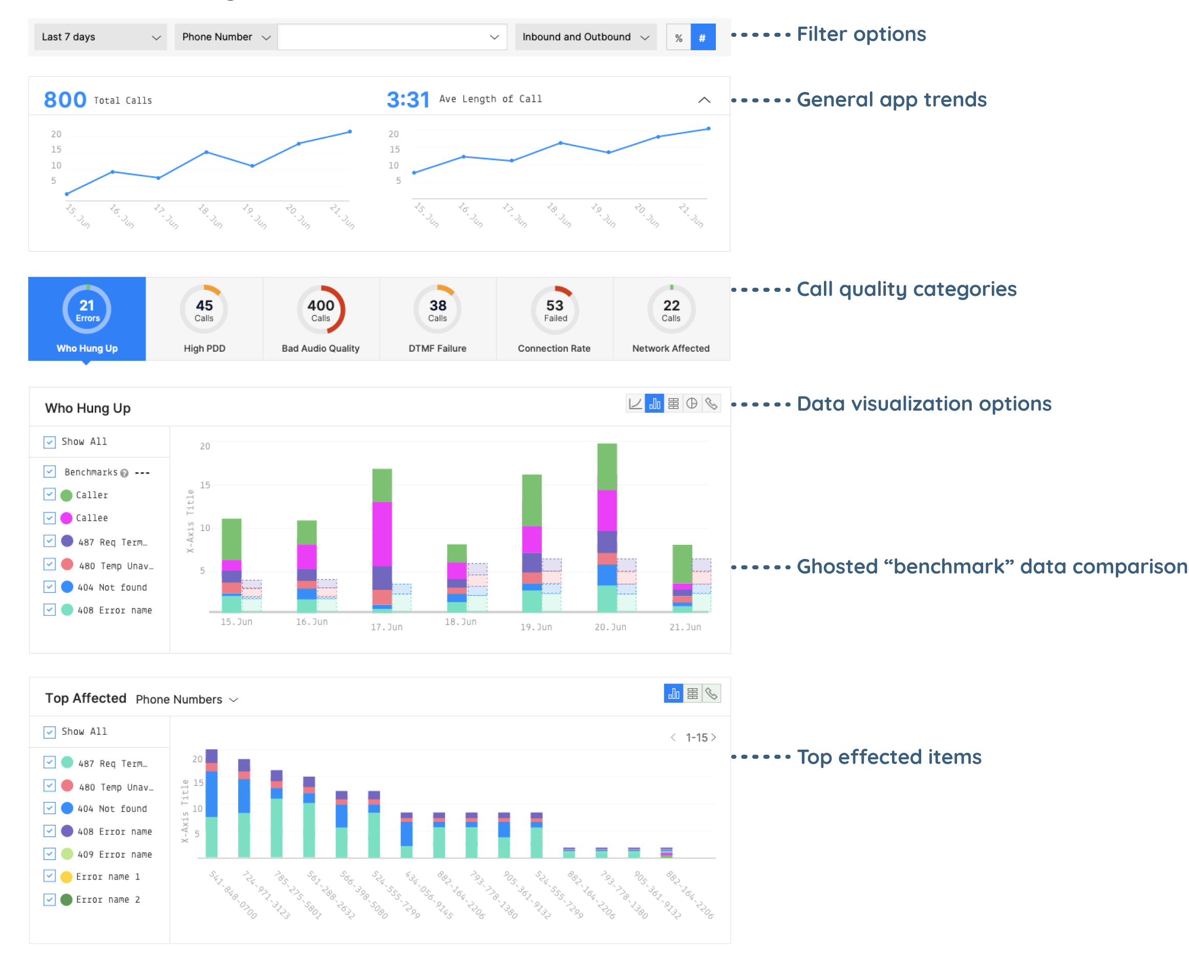
Given the engineering complexity to surface a massive volume of call quality data, we decided to ship it iteratively, adding more data types in each release. I wanted the dashboard to present this data in a manner that was easily digestable for customers.
I divised 3 modular design options that would easily adapt with each release.
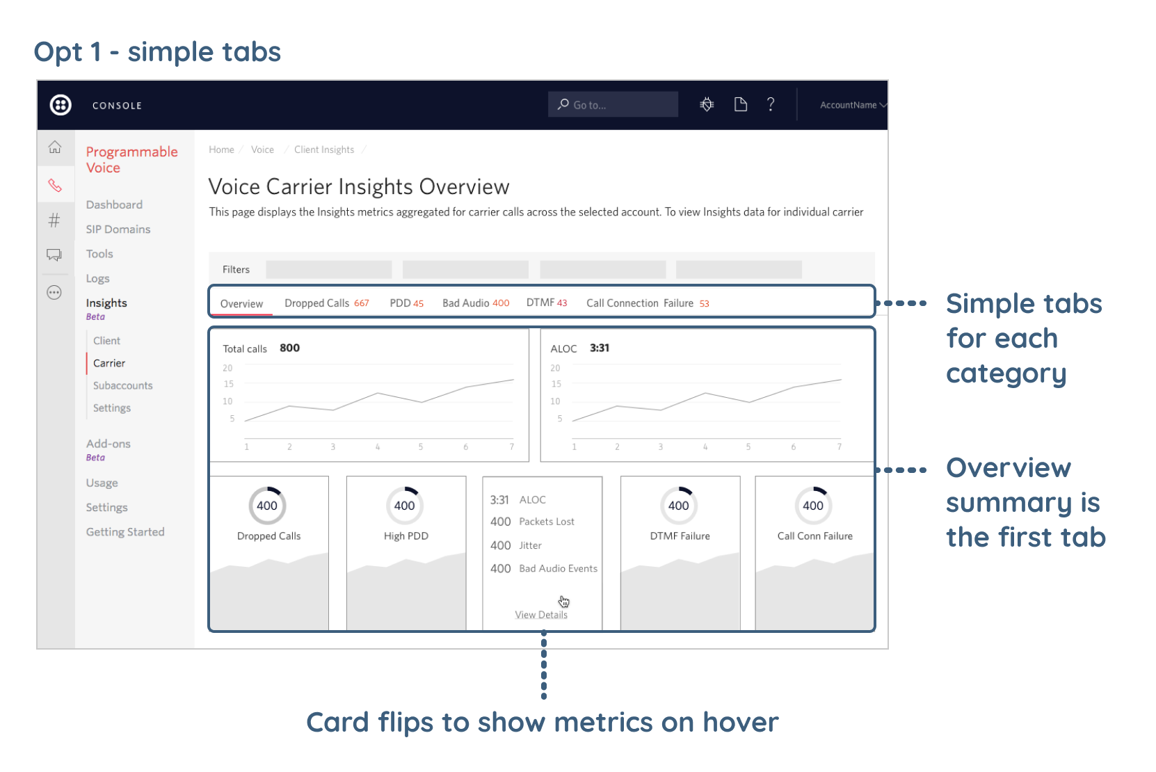
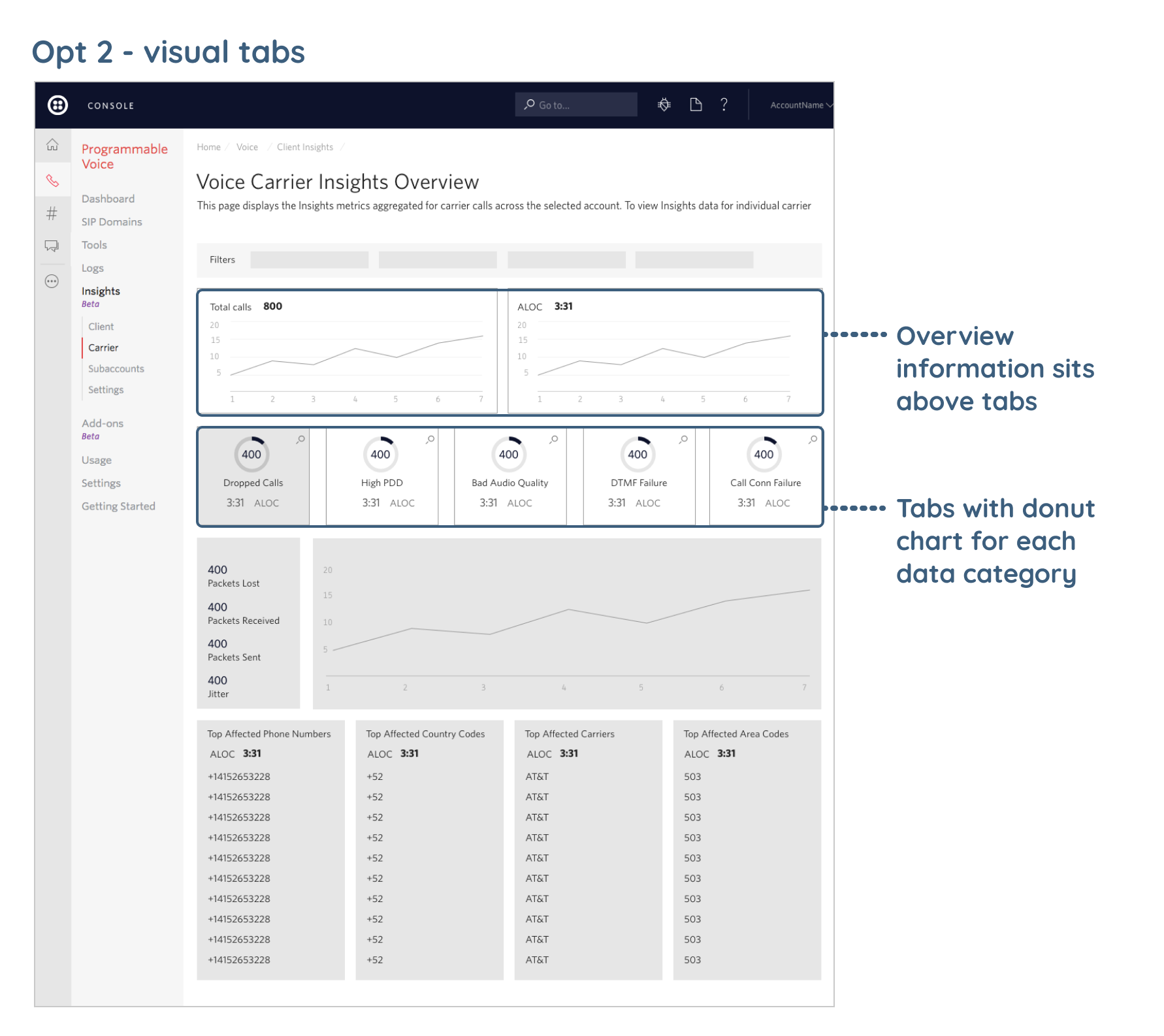
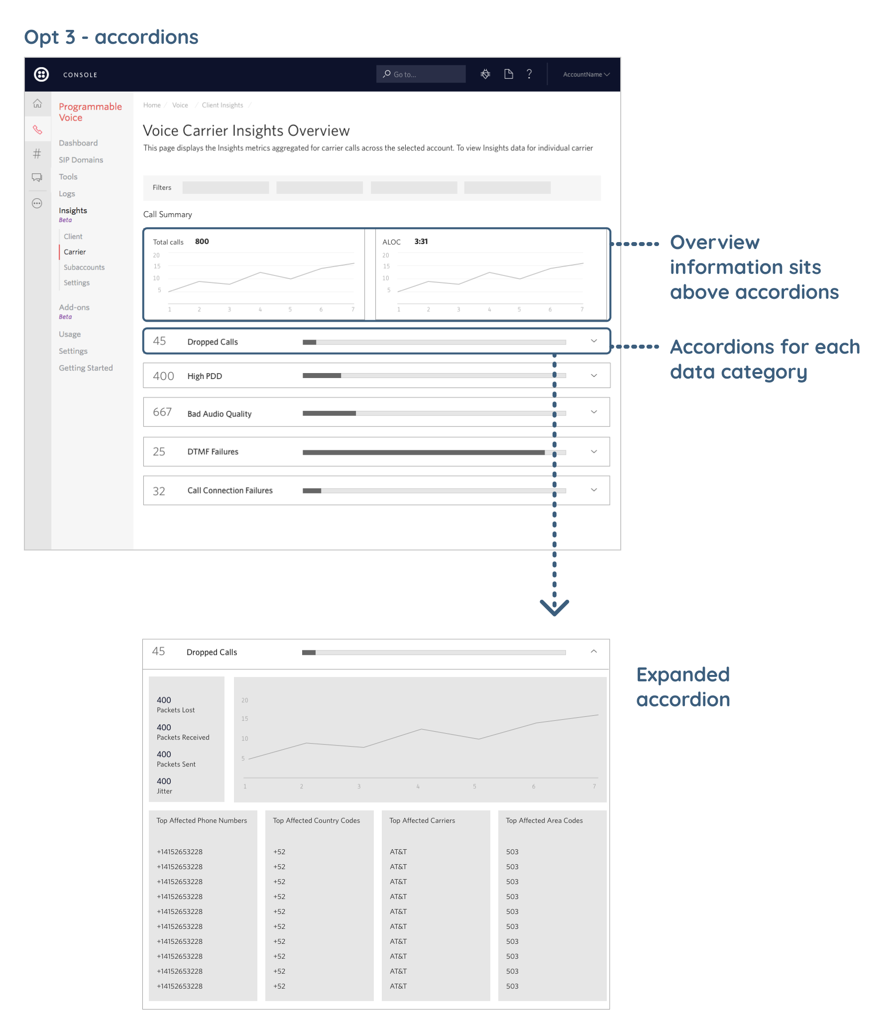
After reviewing the various options with internal stakeholders, we decided to get some early feedback from our customers on the three options. We wanted to answer several initial questions:
- How important is "overview" information and does it deserve a focused view?
- Which layout best supports our users' needs?
- Is there anything missing from this solution?
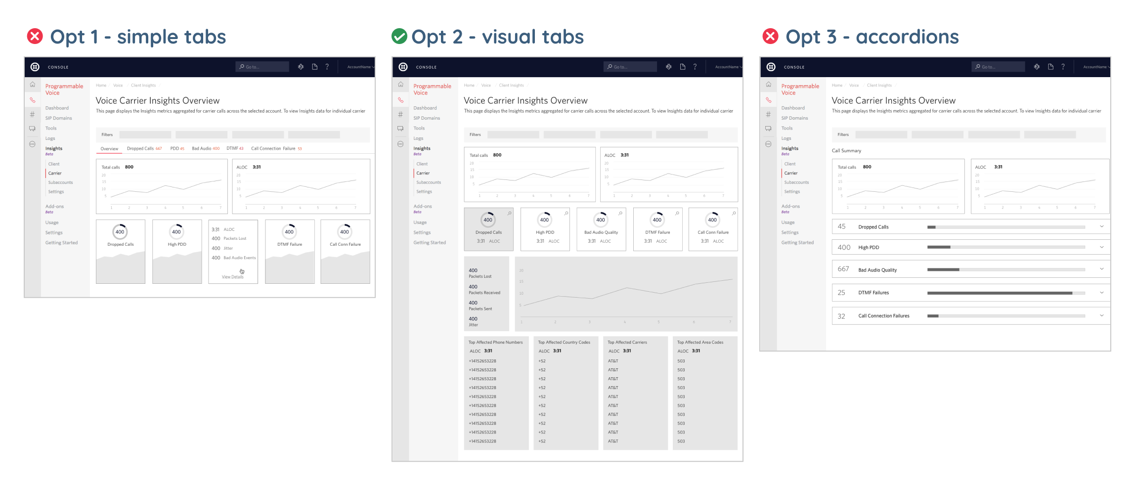
We previewed and discussed the 3 options with 6 ISV users. From those discussions, we learned that:
- The overview information is good to have but it's not as important as the call quality data, and doesn't deserve its own tab.
- Users gravitated towards option 2 because the visual tabs helped them quickly scan for what issue was occuring. They didn't like the accordions as much because they required too much scrolling.
- Some users were concerned they could not address the severity of call quality issues without some sort of baseline for comparison.
- Users were concerned that they would have to watch this dashboard all the time to catch problems.
Based on this feedback, I shared my concern with the team about the usefulness of this dashboard without any alerting system. The engineering lead investigated creating an alert system and determined it was too much work for the first phase. However, we agreed that alerts were critical to the long-term success. Talking with other teams about this project revealed the general need for alerting across our platform which is an ongoing cross-team effort.
I also advocated for a way for users to see a comparision of their calls to a general benchmark so that they had something to compare their data to. We ended up adding a "benchmark" view.
A modular dashboard design
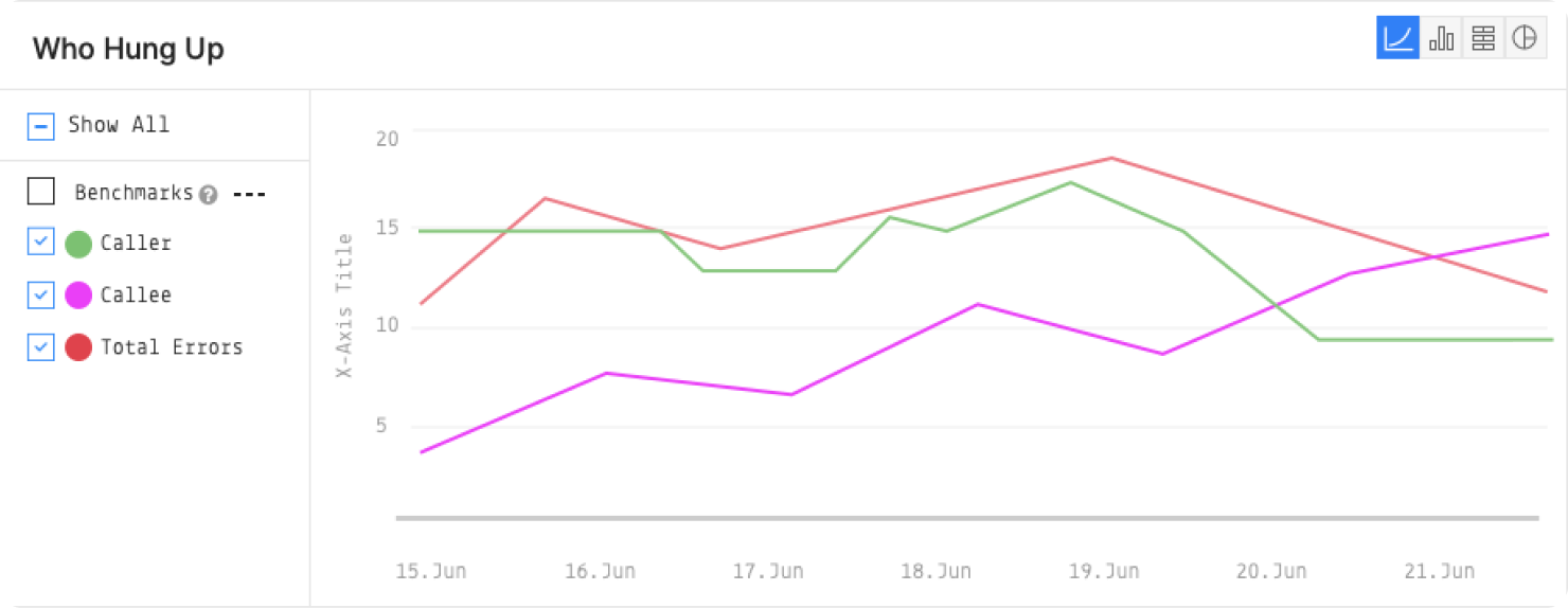
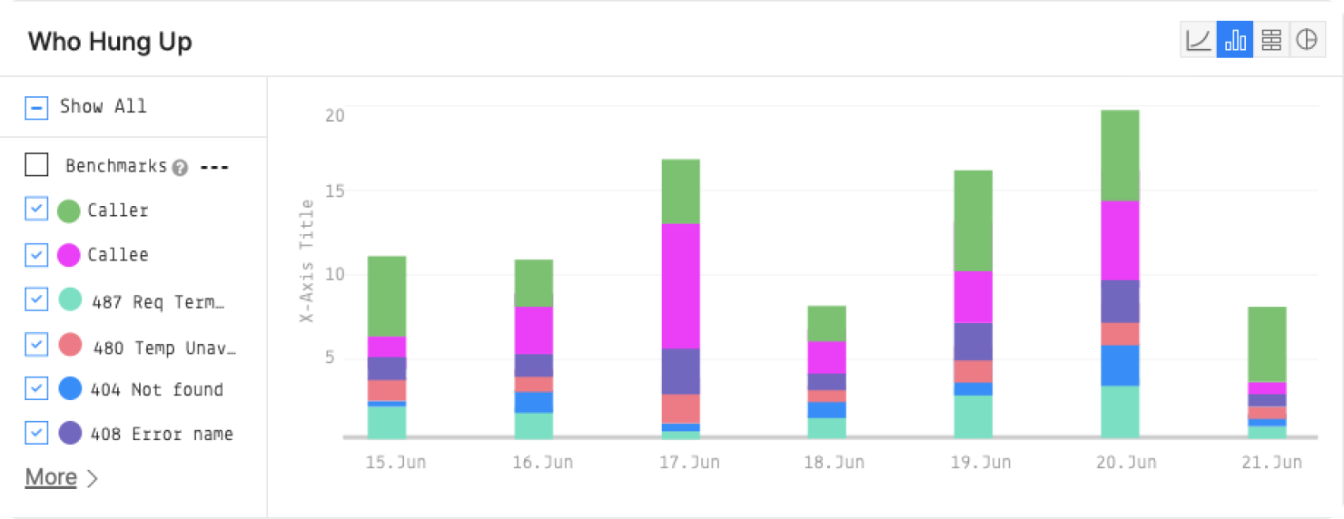
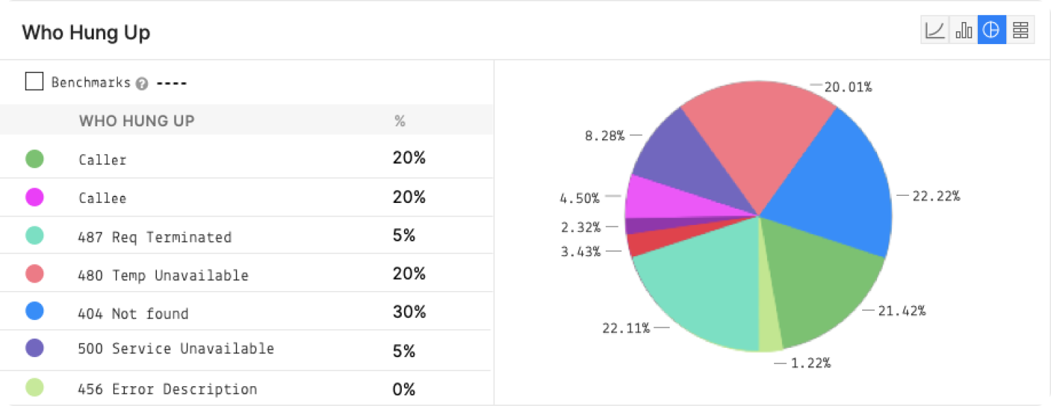
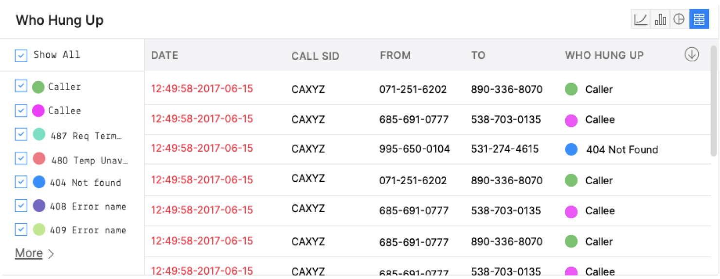
To enable the ability to build this dashboard in phases, I designed modular dashboard components that could evolve over time to incorporate more data visualizations, call quality data types, and filters.
Results
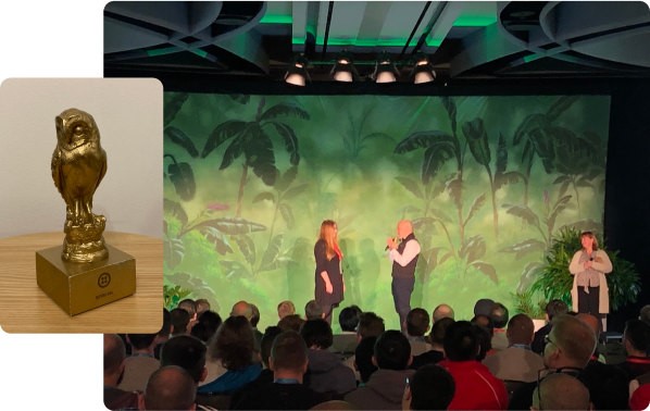
The Call Insights Dashboard was launched in 2018 and won Twilio's "Superb Owl" award in 2019, an internal award for exceptional work. The modular design has proven to be very scalable as we've continued to add more visualizations, data types, and filters since its initial launch. The design continues to give our Voice application users the ability to quickly scan and digest a lot of complex data. In the meantime, we've seen a sharp drop in call quality support tickets as users are now able to diagnose and address issues on their own.
