Twilio's Developer Console
Twilio is a leading CPaaS company that offers API building blocks for the development of communication software like call centers, notification systems, and chatbots. The Twilio developer console has 65K weekly active users from companies like Zendesk, ING Bank, Ebay, Stripe, and many more!
My role
Beginning in September 2019, I served as the lead and sole designer, working on research, design, and information architecture for an overhaul of Twilio's developer console. There were many other designers working on individual products within the console, but for years, no one had owned the 'connective tissue' or information architecture of the console. I worked alongside a product manager and 2 engineers, soliciting frequent feedback from fellow designers and stakeholders across the company.
Background
In order to scale rapidly, the developer console was architected in 2016 to enable autonomous product teams across Twilio to build their own console pages. This strategy was optimized for rapid growth, but led to a lot of inconsistency and duplication as the platform grew to 30+ products.
Discovery
To get started, I combed through customer surveys, support tickets, customer interviews, and engagement analytics and found a wealth evidence that the console’s information architecture wasn't supporting our users' needs.
"The UI navigation doesn't seem organized into any logical fashion, or it’s too logical and done from the perspective of someone who knows deeply how the whole thing works."
“This website is incredibly unintuitive and difficult to understand or navigate."
“...twilio console needs some work on UI. It can be better, easier to use/navigate…."
-2018 CSAT survey participants
Findability and navigation pain
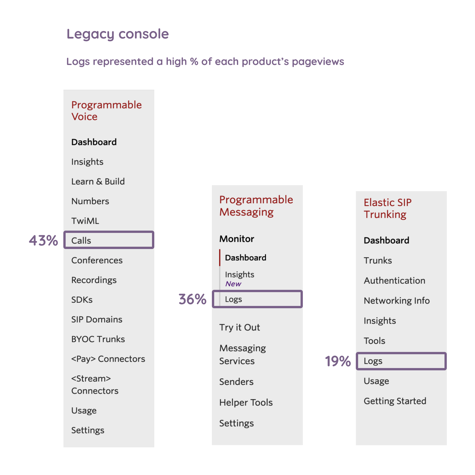
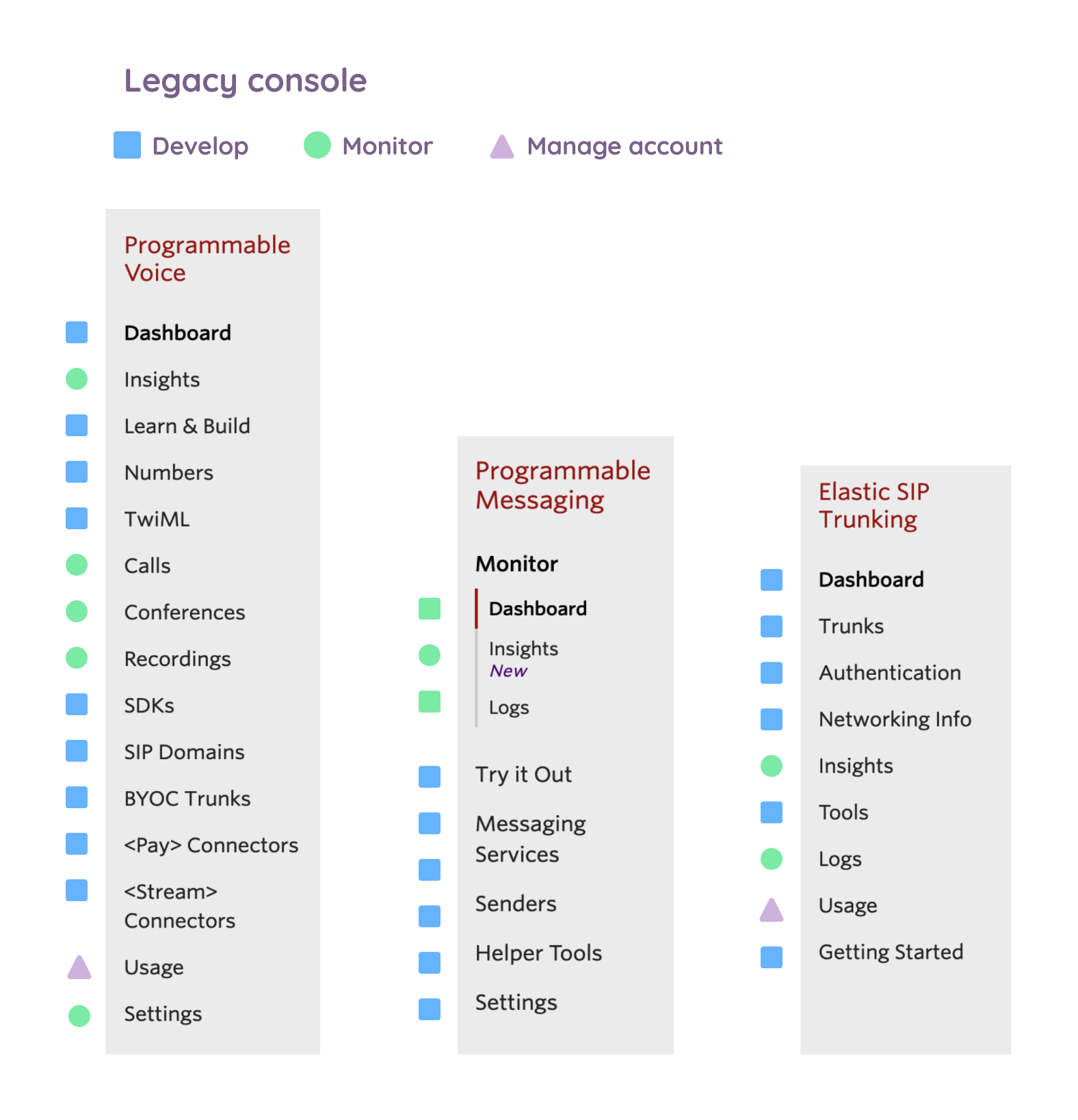
As I reviewed pageviews and click path analytics, a picture began to form that showed users jumping around different areas of the console to complete common workflows. Product log pages, used to troubleshoot Twilio applications, were seeing very high amounts of traffic, but were positioned inconsistently in each product.
The data seemed to suggest that the product-centric information architecture was creating cognitive load for our users as they struggled to find the pages they needed to do their work.
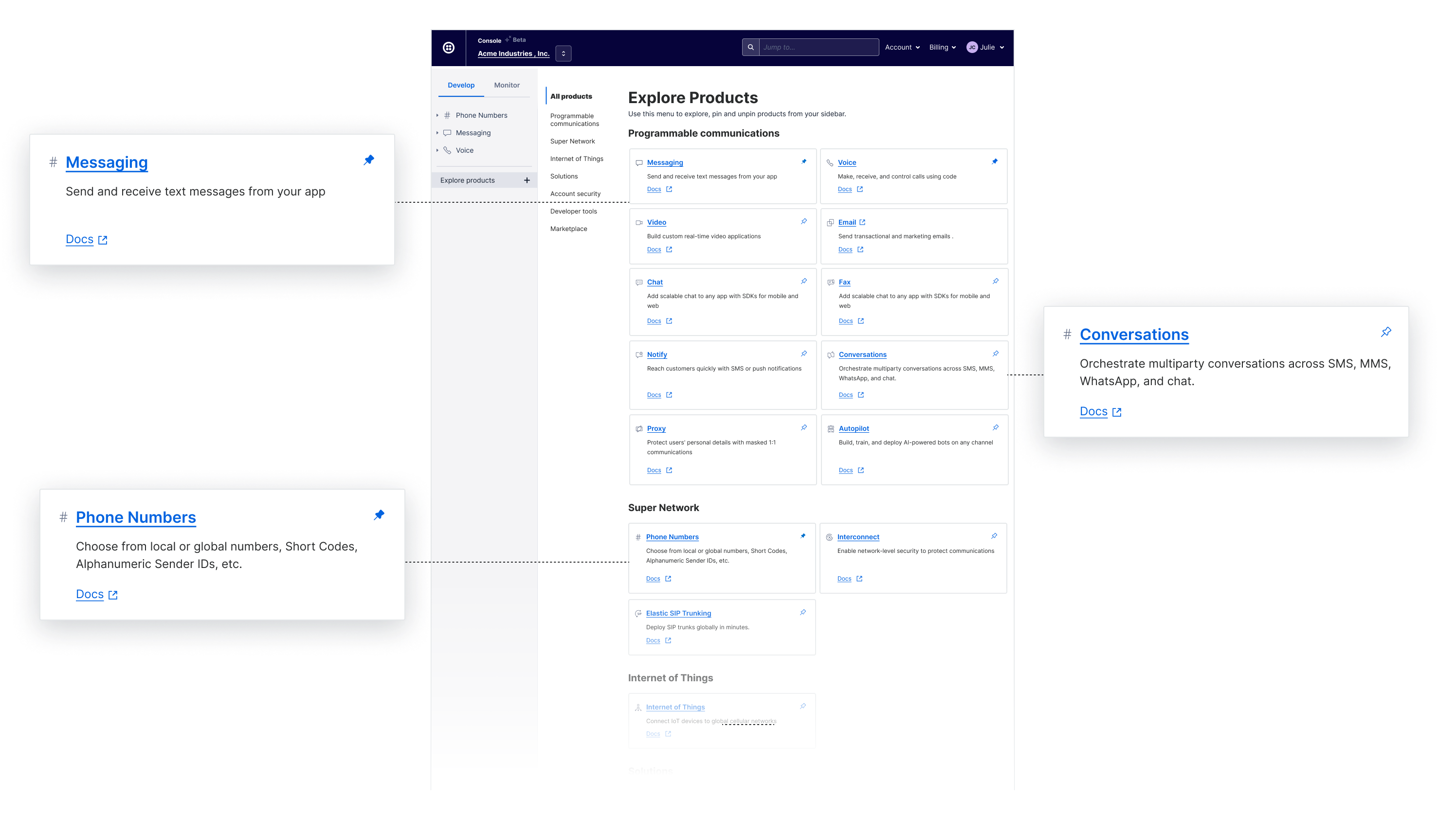
Discovering new products
In addition, the product manager determined that our revenue was largely driven by multi-product accounts, yet we'd heard from users that it was difficult to learn about new products and it was easy to see why. Our product menu was just a static list of products with no information.
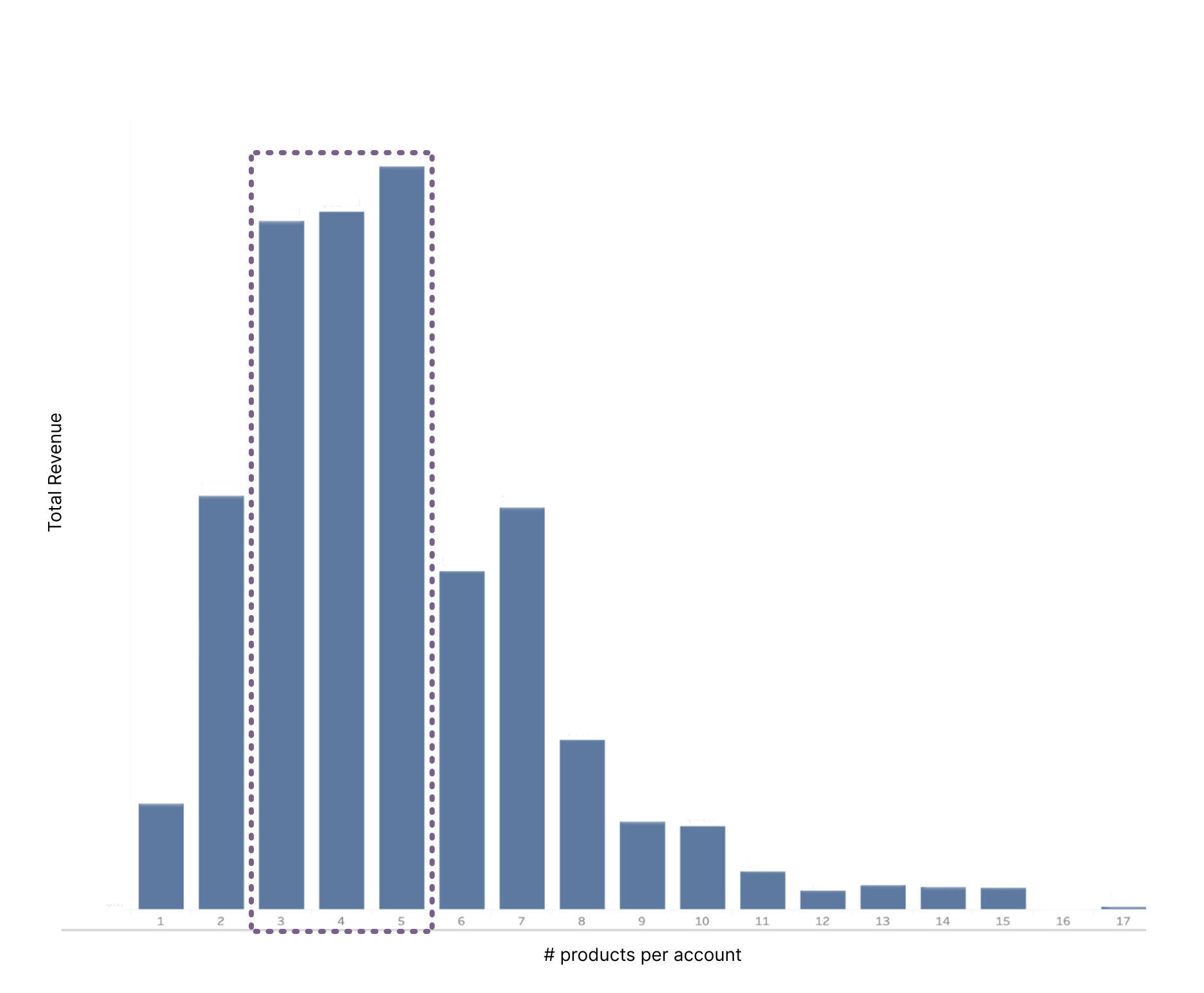
We saw a win-win opportunity for our users and the business by creating a simplified console that allowed users to build multi-product applications and discover new products.
Constraints and scope
In addition to improving the user experience, there was an internal opportunity to unify our code base and improve engineering efficiency.
Our scope for the first phase of this project included 2 things:
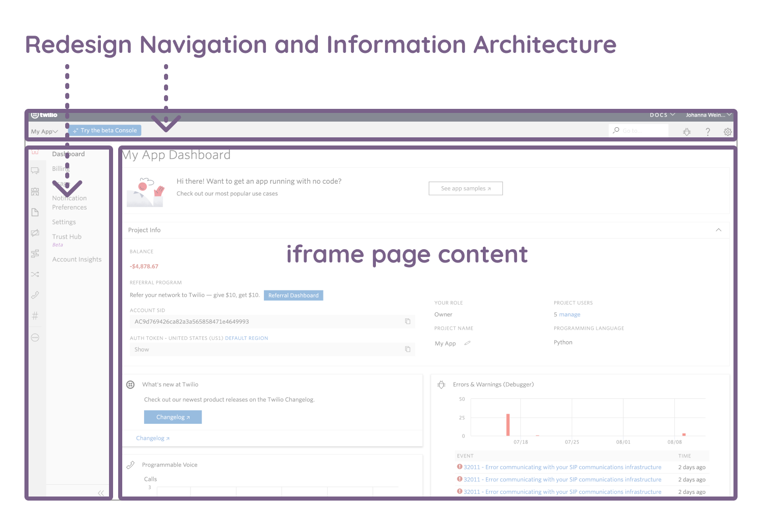
- Redesign navigation and information architecture
- Create a fast, modern, unified front-end platform
To reduce dependencies and give product teams flexibility on the timing of their migration to the new platform, our engineers determined that we could rebuild the navigation and pipe in the current console pages through an iframe temporarily.
Focus areas
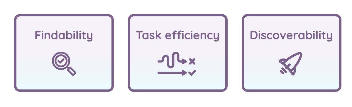
Based on our research and established scope, we defined these user goals for the navigational redesign in phase 1:
Information architecture
To assess our users' mental model of Twilio, I ran a card sorting study, in which developers were asked to categorize a variety of Twilio-related tasks in a manner that was logical to them.
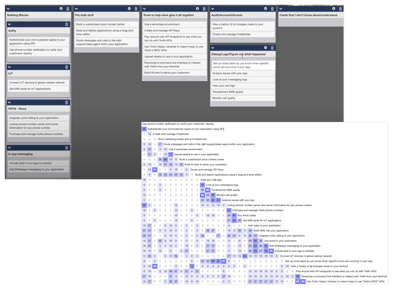
Results indicated that developers expected the console to be organized through the lens of their development lifecycle, rather than product vertical.
I developed a map of these phases to guide us in how we approached the new design.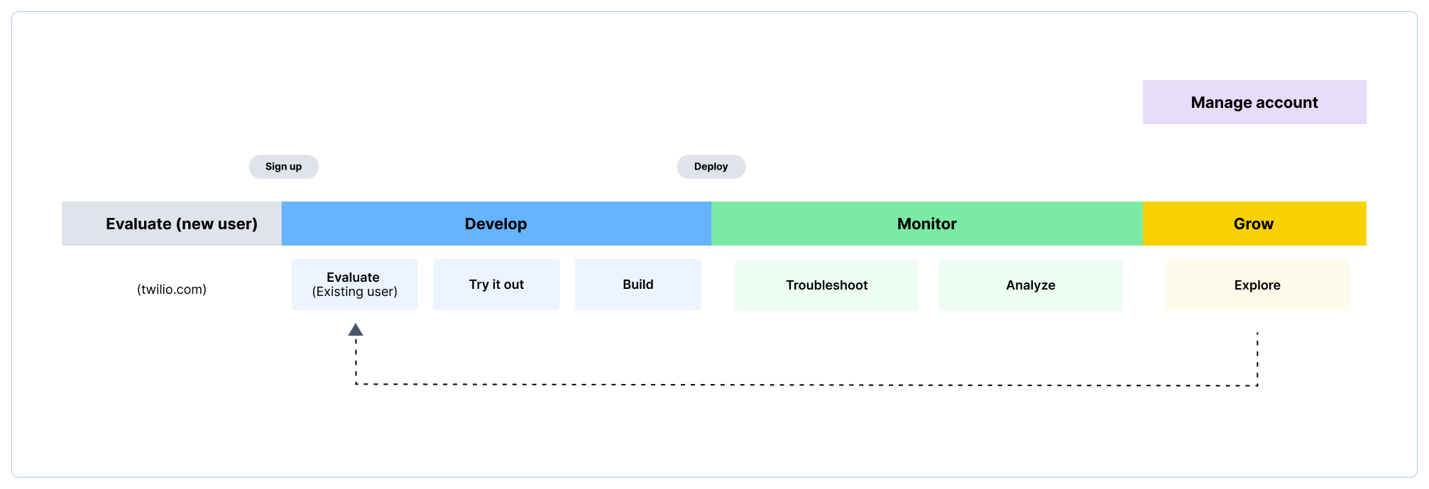
We wanted to explore how we might better support console users by creating a structure that organized content in terms of lifecycle phases.
When we looked at the current navigation structure, we saw content for many different lifecyle phases and tasks mixed together without any consistency.
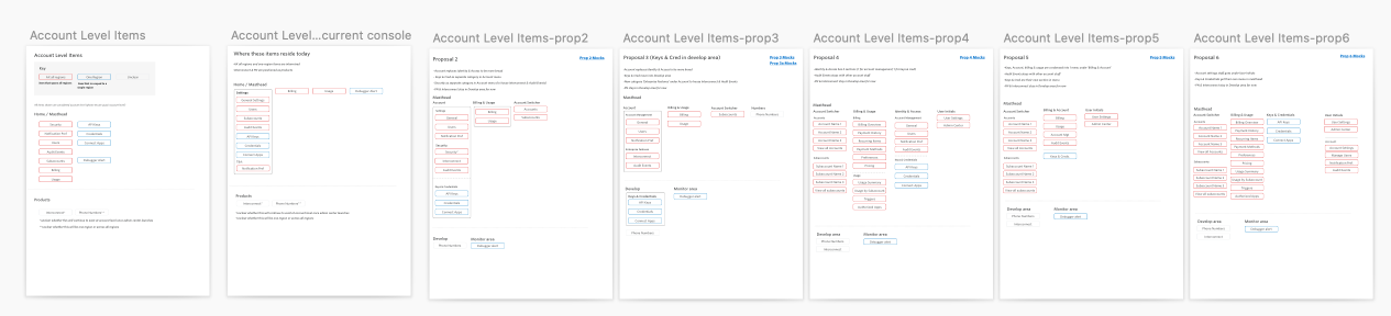
The principle of using lifecycle phases to segment content made certain decisions very straightforward. There were open questions remaining, however, about items that did not fit perfectly into a single section which needed to be ironed out. I worked on a number of proposals to help us weigh the options and come to a decision.
Redesign
The following are a selection of design explorations and decisions that we made as we moved into the design phase.
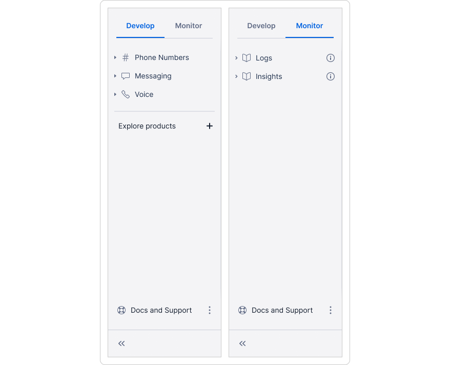
Side navigation
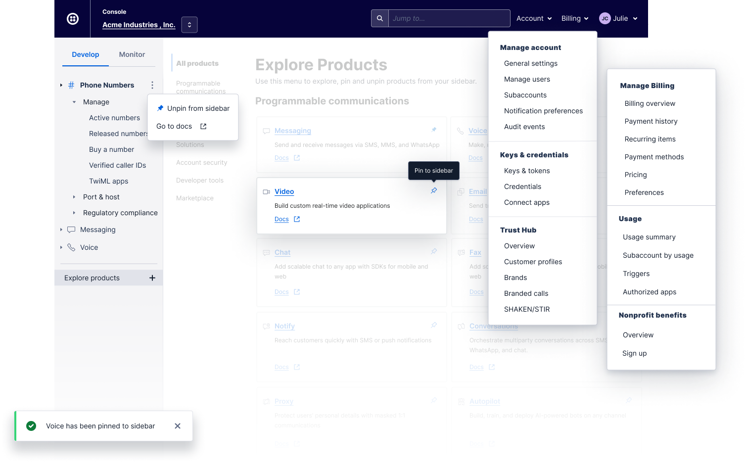
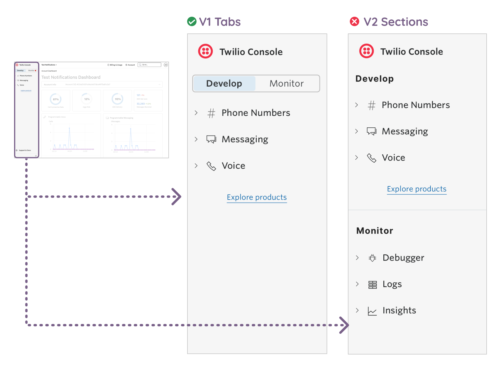
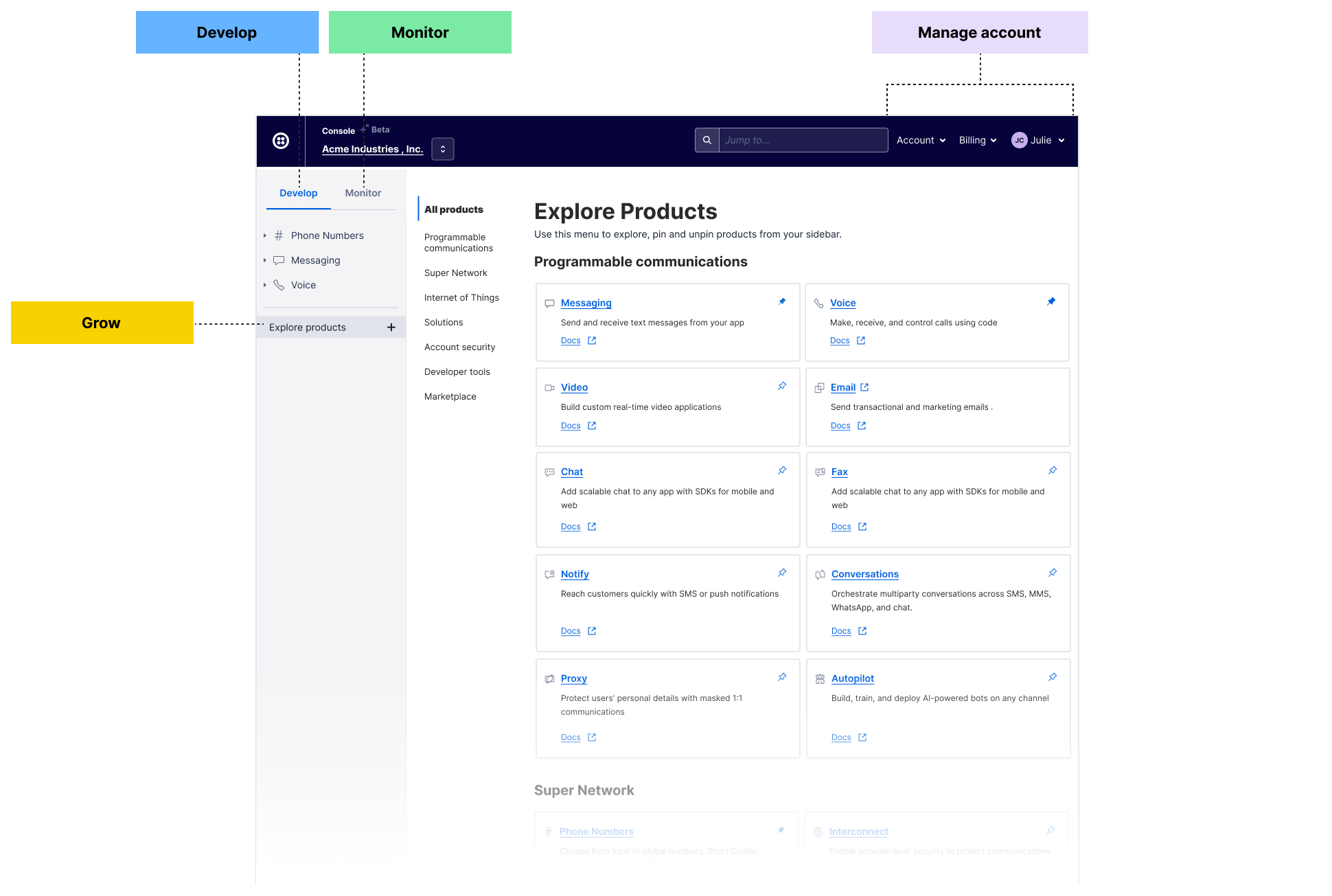
The left side navigation needed to support the core parts of the developer's journey: "Developing" and "Monitoring". I iterated on a number of directions, and after gathering lots of internal feedback, my team decided to test two directions: vertical sections and horizontal tabs. Through testing, we saw that 7 of 8 users preferred the tabs because it was cleaner and allowed for a focused view. We also felt these would scale better as more content was added.
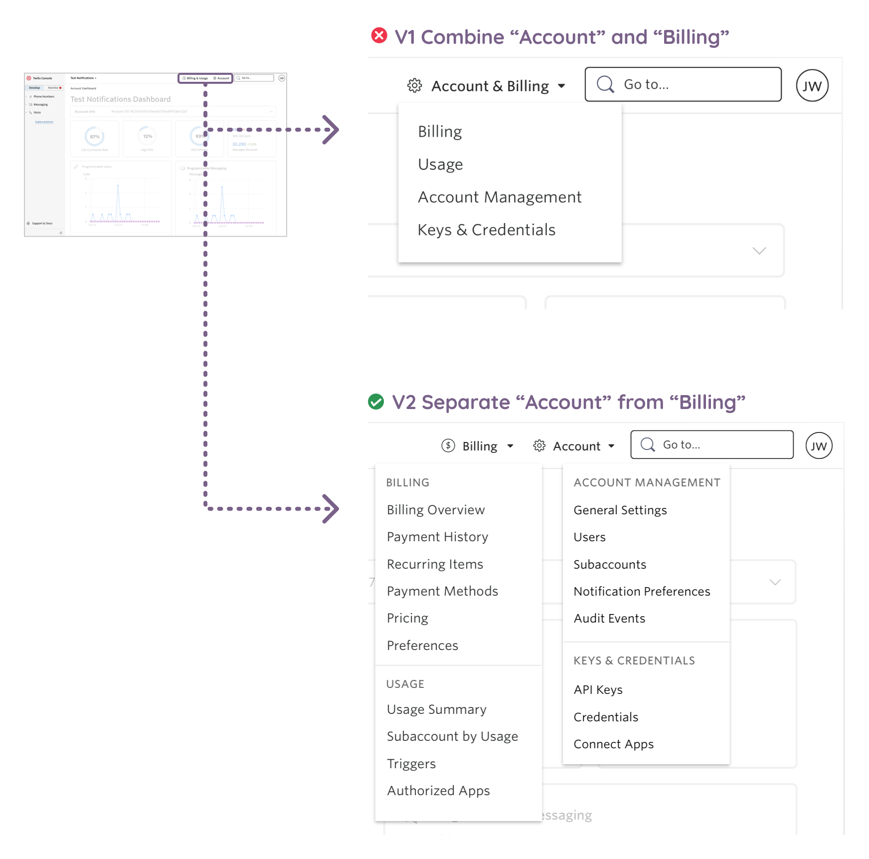
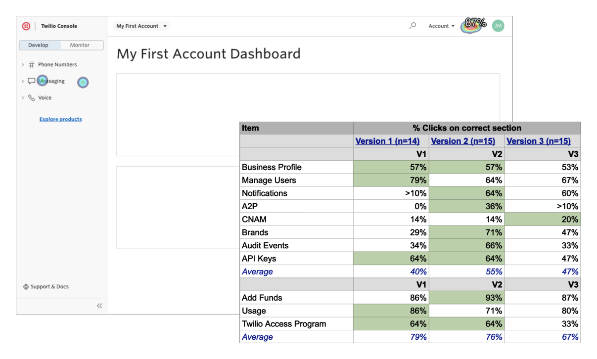
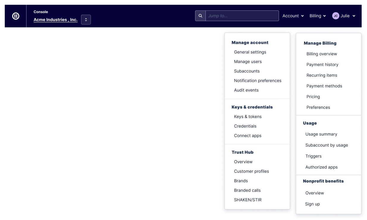
Account administration and billing
In the legacy console, pages related to billing and account administration had been poorly organized and difficult to find. The lack of a centralized location for them led to dozens of redundent pages across the console. We wanted to consolidate these pages to the top right area for visibility, but we were unsure whether account and billing should be combined into one menu or separated. We tested this with target users. 5 of 6 users preferred to see all pages listed in the menu so they could easily jump to the page directly. Showing every page in the menu was not possible in the combined view because it became too long and overwhelming. For these users, keeping the menus separate better supported their workflows.
Content design
The labels for these sections needed to guide users with clear, concise descriptions. I pulled the verbatim terms our customers had used in my card sorting research as a starting point and worked with the appropriate product teams to align on what options to consider:
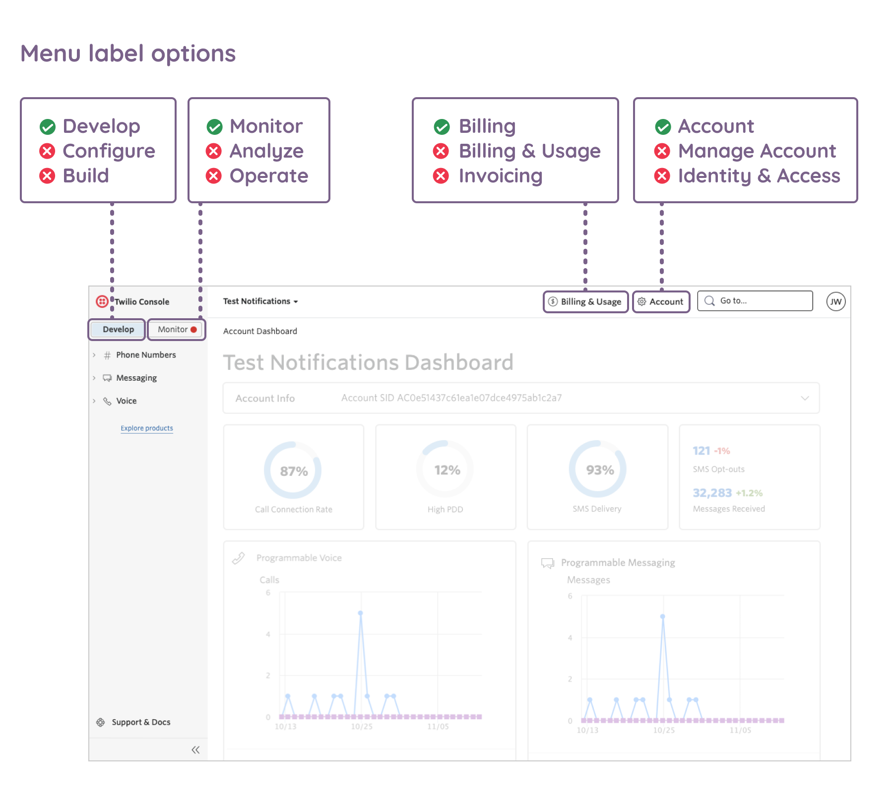
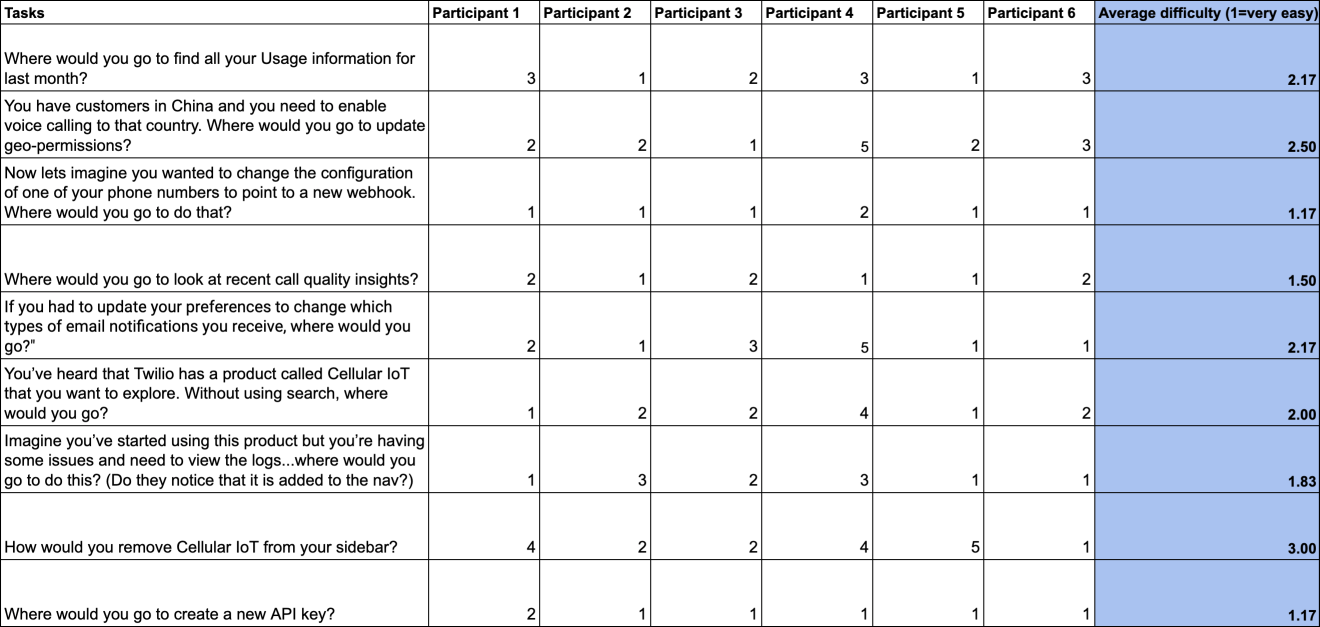
I ran 3 rounds of unmoderated click tests with Twilio users, asking them where they would go to perform common tasks. I changed the labels shown in each round in order to find out which were most intuitive. The final labels we chose, based on this research, were “Develop”, “Monitor”, “Account”, and “Billing.”
Final visuals
The final visual design was based off of our design system, Paste, developed by the talented designers on that team.
Cross-team collaboration
The most important learning during this project was the need to build trust and buy-in with other stakeholders. Most teams could clearly see the need for this work, but they wanted to be sure our redesign wouldn't slow them down. Driving towards a consistent framework in rapidly growing company was a bit like building an airplane while in flight. My product manager and I approached these meetings by illustrating the ways these changes would improve the overall experience for our customers while removing redundant efforts internally, leading to a more efficient use of resources.
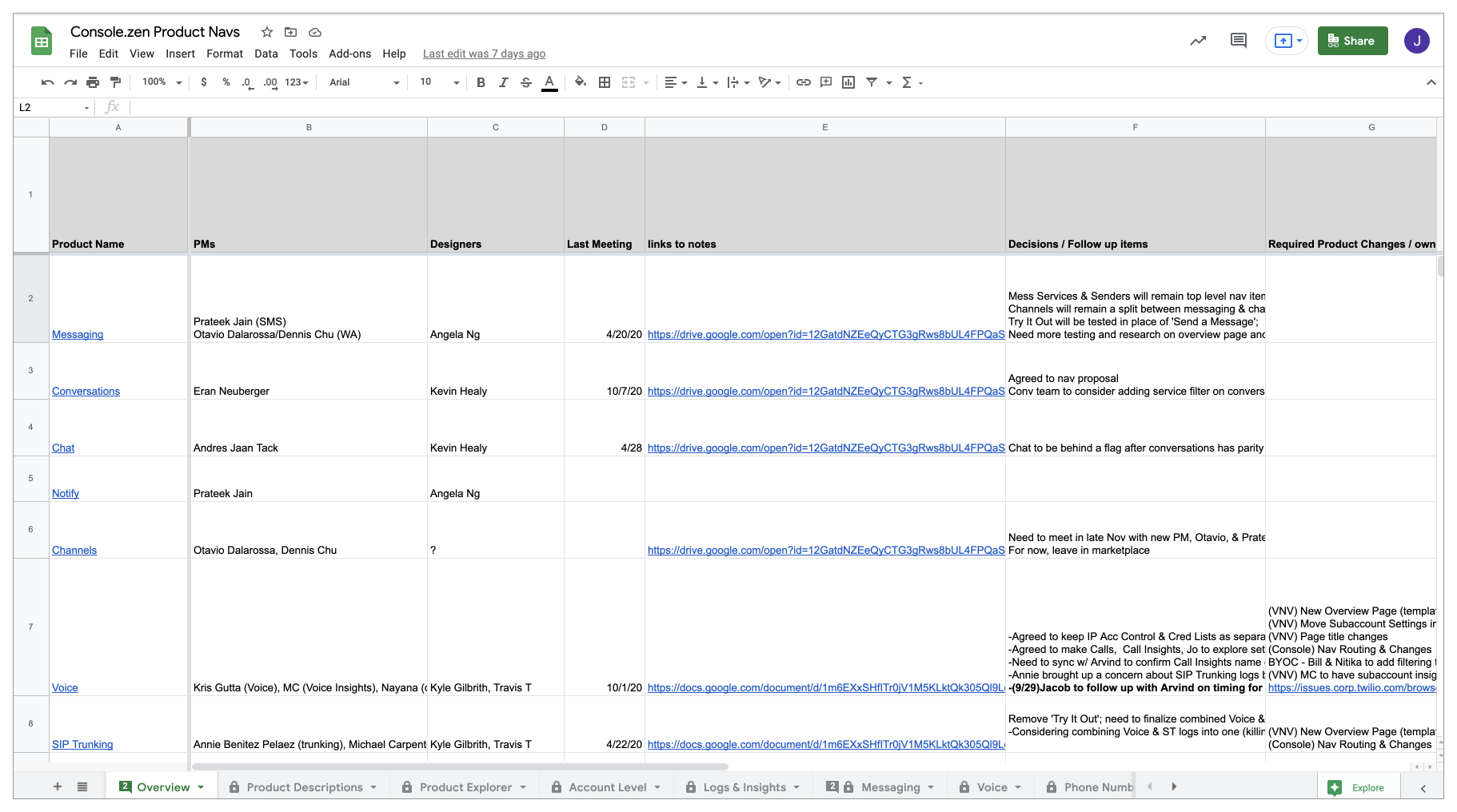
In addition, systematic documentation of data, research, meeting notes, decisions, and open questions allowed our team to keep track of a complex multi-part project as well as to keep each product team aware of our work. By treating every team as a partner and staying focused on the user research and data, we were able to build consensus and achieve the new vision.
Results
The new console was launched in beta in early 2021, and all users were able to opt in and out as they wished. We added a feedback widget which I monitored daily to help prioritize refinements and bugs fixes. We ran a customer satisfaction survey in both the legacy and new consoles that measured satisfaction with findability, task completion, visual appearance, speed, and discoverability of new products. We saw an increase in each category with an average overall satisfaction increase of 8%. This was a positive indicator that our new architecture was improving the experience, and was a good first step that we could now build on.
"The new console is 1000% better than the old one, now you can actually find stuff."
"I think it's one of the best consoles out there. I especially like the new monitoring feature, which helps me troubleshoot my API issues. No one else has this."
-2021 CSAT survey participants
Our front-end platform was also recognized by the broader community as Jamstack's project of the year winner. This blog post highlights the amazing engineering work for this project.
🚨 Another Jamstack Jammies award winner for the Project of the Year award goes to .....
— Jamstack (@jamstackconf) October 6, 2021
🚀The new @twilio Console🚀
Congratulations 🎉🎉🎉🎉
We've since begun to grow the team in order to address many initiatives that can be built on this foundation.